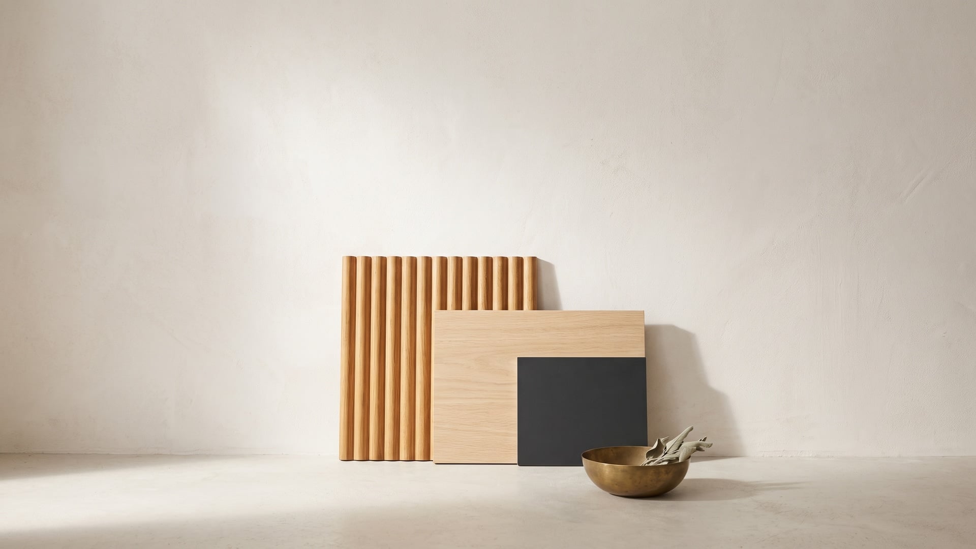
For most of the last two decades the premium interior surface was defined by flawlessness — the flatter, the glossier, the more seamless, the better. That instinct has quietly reversed. The surface everyone now wants to reach out and touch is the one with relief in it: a wall of vertical channels that throws a slow rhythm of light and shadow, a headboard of fine reeds, a wardrobe shutter grooved so cleanly it needs no handle. Three-dimensional wood — fluted, reeded, grooved and lightly brushed veneer — has become the defining feature-wall material of the moment, and unlike most things that carry that label, it looks likely to outlast the moment that made it.
The reason is worth understanding before you specify it, because texture behaves differently from colour or pattern. A bold hue makes a single fixed statement that either works or dates; a textured panel makes a different statement every hour, as light moving across the room grazes its ridges and redraws its shadows. It reads as considered rather than loud, it survives being photographed, and in taste terms it ages far more slowly than any accent colour.
A short vocabulary of texture
The words get used loosely on site, so it helps to separate them. All four describe relief in a wood surface, but they are made and read quite differently.
- Fluted — a run of shallow concave channels, like a row of half-pipes hollowed into the face. The eye reads a series of soft valleys, and shadow pools in the hollows.
- Reeded — the exact inverse: convex ridges, or beads, standing proud of the surface like a row of half-round dowels. Where fluting recedes, reeding advances, catching the light on each crest.
- Grooved — parallel cuts, usually V- or square-sectioned, incised into an otherwise flat panel. The face stays flat between the lines, so only the groove carries the shadow, giving a crisper, more architectural, less sculptural rhythm.
- Brushed — the subtlest of the family, and not a machined profile at all. A wire brush erodes the softer early wood of an open-grained species and leaves the harder grain standing, so the texture follows the tree's own lines. You feel it before you see it.
Fluted and reeded give the boldest relief; grooved is tighter and more geometric; brushed adds tactility without changing the panel's silhouette. Some of the best walls combine them — a reeded field with a brushed finish — so the surface works at both arm's length and across the room.
How a three-dimensional panel is made
A textured veneer panel is an engineered object, and how it is built tells you a great deal about how to specify it. There are two broad routes to the relief, plus the separate business of the finish.
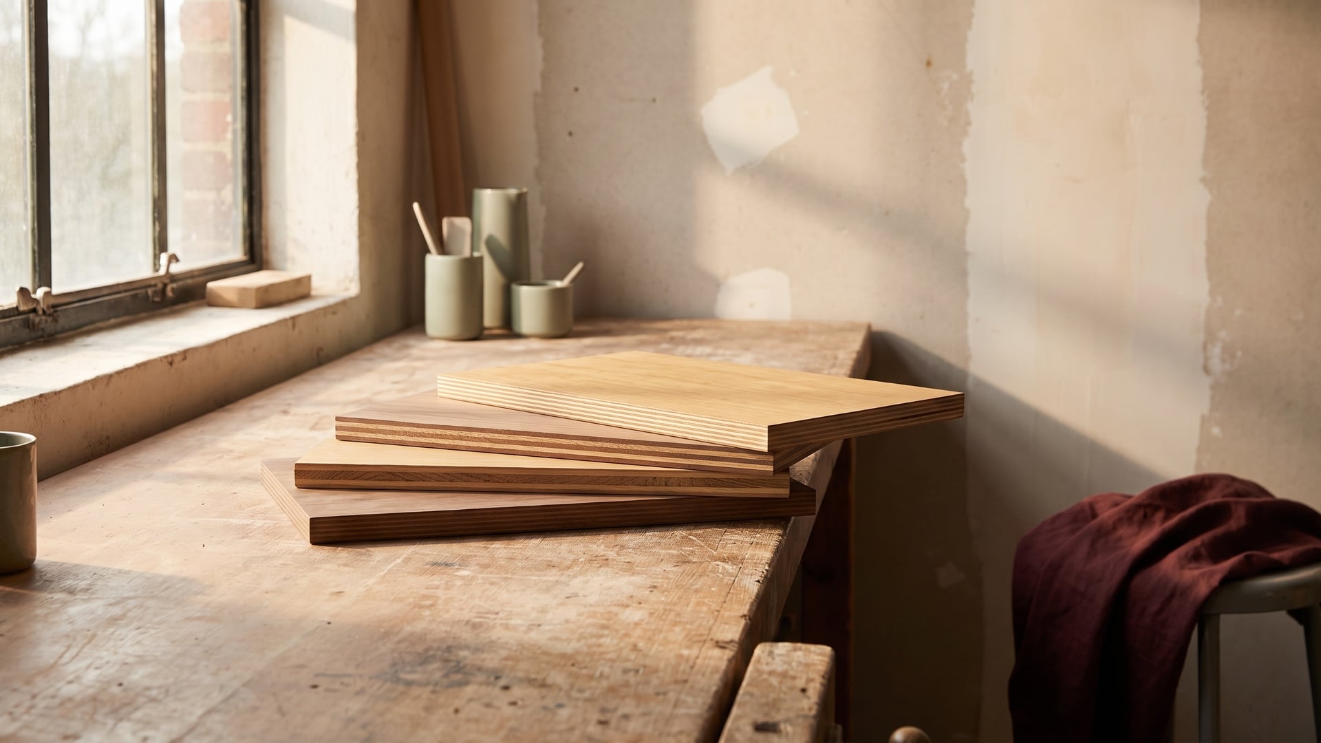
The first route machines the profile into a stable core: a sheet of MDF or plywood is moulded or routed with the fluting or reeding, and a flexible natural veneer is pressed over the profile so the grain runs continuously across every ridge and valley. The second route builds the relief up — individual reeds or slats, in solid timber or veneered MDF, are bonded in parallel onto a backing board, which is how most deep panels and acoustic slat walls are produced. Grooved panels are simpler still: a flat veneered board is routed with fine parallel channels, the groove often lined or tinted a shade darker to deepen the shadow line. Brushed texture is a finishing operation — the veneered face is wire-brushed to open the grain — and can be applied on its own or over any of the profiles above.
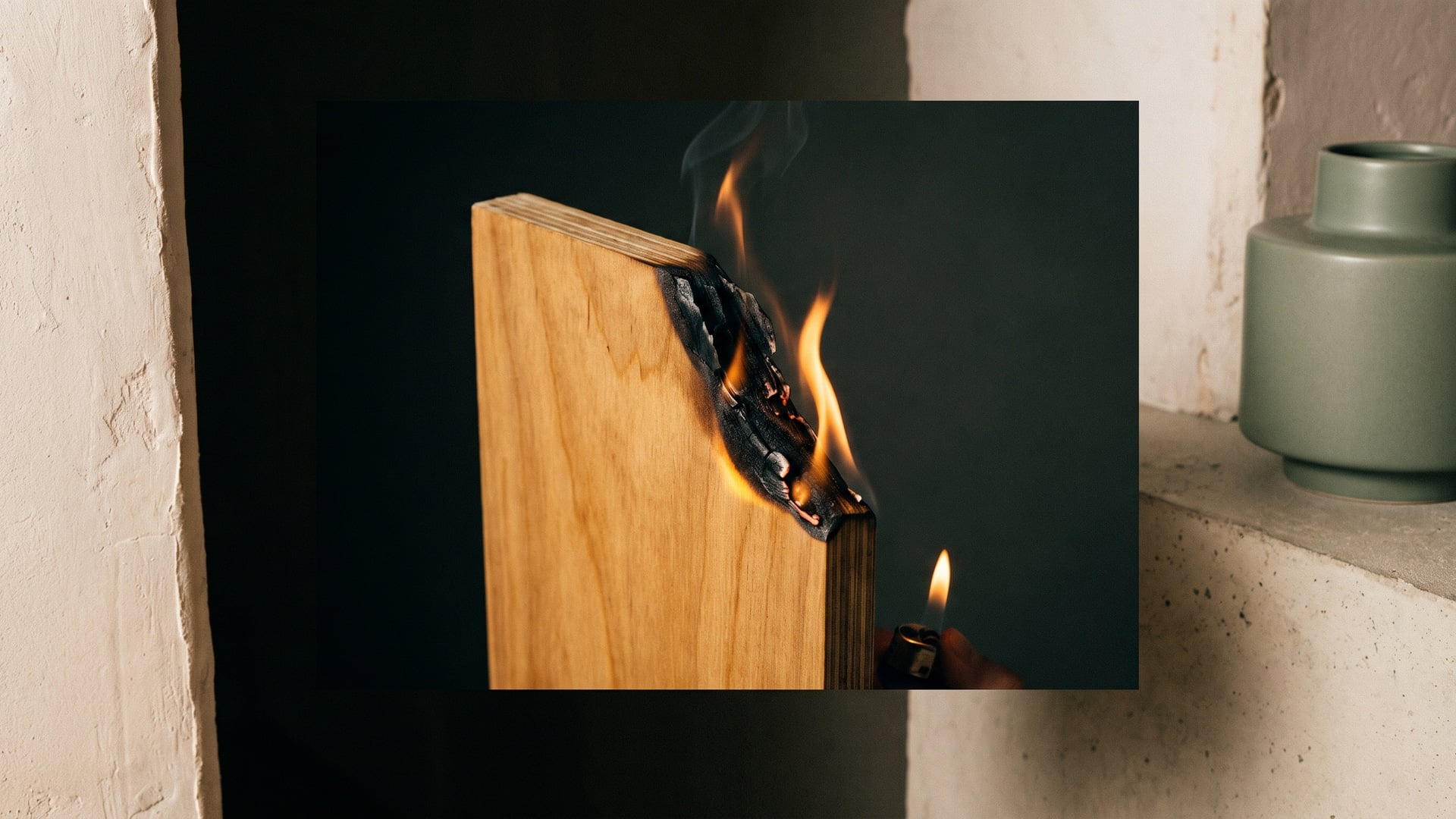
Two things follow from this. First, the face is real wood, so grain match still matters: on large or continuous runs, panels should be sequenced from the same log so the rhythm of the flutes is not interrupted by a jump in colour or figure. Second, the panel is only as stable as its core. In India's climate — long humid monsoons, then dry heat that pulls moisture back out — an under-specified core can move enough to telegraph through the face or open the veneer along a ridge. Match the core to the room: a moisture-resistant (IS:303) grade for genuinely dry interiors, and a boiling-waterproof (IS:710) core wherever humidity is relentless, such as a coastal home or a wet zone.
Why texture reads as premium
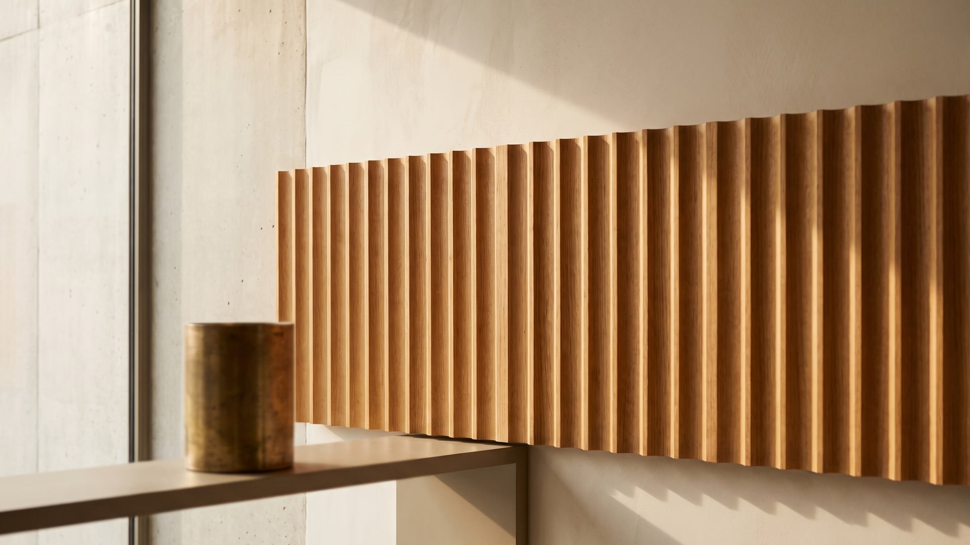
Ask why a fluted wall feels expensive and the honest answer is that it puts on a quiet performance no flat surface can match. The heart of it is light. A textured panel is never one flat tone; it is a gradient of highlight and shadow that shifts through the day as the sun tracks across it, and again in the evening under a lamp. Morning grazing light rakes long shadows into the flutes; midday flattens them; a warm lamp at night picks out the crests. It also invites touch in a way a printed or glossy surface never does. And because the depth is physical rather than printed, it photographs with genuine dimension, which matters when interiors are judged first on a screen. Most importantly, texture is nearly colour-neutral. A bold accent hue commits you to a fashion moment and begins dating the day it is installed; a fluted panel in a calm natural wood carries no such expiry. It reads as considered rather than loud, and considered ages slowly.
Where three-dimensional veneer works best
Textured veneer is a feature material, and it rewards being used where a room already wants a focal point. The strongest applications share a quality: they are surfaces people look at, stand before, or reach for.
- Living-room feature walls and television backdrops — the classic use. A full-height fluted wall behind the television turns an unavoidable black rectangle into part of a composed surface rather than a hole in the room.
- Headboards and bedroom panelling — a reeded or fluted panel behind the bed gives a hotel-like sense of enclosure and warmth, and its soft relief suits a room meant for rest.
- Reception desks, retail fronts and hospitality — a textured front carries a brand's surface at exactly the height and distance a visitor first meets it, and holds up to being seen by hundreds of people a day.
- Handle-free wardrobe and cabinet shutters — perhaps the cleverest use, where the fluting is not only decorative. The vertical channels double as the grip, so the shutter opens with a fingertip in the groove and needs no handle to interrupt the run.
The common thread is restraint in placement: one commanding surface, sited where the room's eye already lands.
Specifying it well
Texture is easy to over-do and easy to under-light, and most disappointing installations fail on one of a handful of decisions. Get these right and the wall does exactly what the sample promised.
- Start with a calm, straight base grain. The fluting is the rhythm; the grain should be the quiet accompaniment, not a competing melody. A busy, wild figure fights the profile and the wall reads as noise, where a straight-grained, understated veneer lets the relief lead.
- Run the grooves vertically. Vertical flutes lift the apparent height of a room and suit most walls; reserve horizontal runs for deliberately widening a low, long space, where they should be the exception rather than the rule.
- Light it from the side. The whole effect depends on raking light. A wash from a spot or a linear fitting set close to the wall, grazing along the flutes, exaggerates the relief; flat, head-on light erases it. Plan the lighting and the panel together, never separately.
- Use one feature wall, not every surface. The impact of texture is a function of the calm around it. Wrap a whole room in fluting and the effect cancels itself out; let one wall carry it and keep the rest of the room quiet.
Pairing with matte finishes and plain solids
A textured panel is a soloist, and it needs a restrained ensemble behind it. The finish on the texture itself should almost always be matte: a soft, light-scattering surface lets the shadow in the flutes do the work, where a gloss would bounce hard reflections and flatten the very relief you paid for, and it keeps the wall calm enough to live with every day.
Around it, favour plain, low-chroma solids and quiet surfaces — a putty or stone-toned wall, an unfigured solid on the adjacent joinery — so nothing competes for the eye. The composition should read as one textured event set against several calm ones. If you want a second material, let it be another quiet texture rather than a pattern or a strong colour: a fine matte solid, or a brushed metal in small doses. The drama is spent once, deliberately, and everything else supports it.
Living with a textured surface
The reasonable worry about relief is that the valleys will trap dust and the surface will be fussy to keep. In practice a well-finished textured panel is easy to live with, provided the routine suits its shape rather than fighting it.
- Dust along the grain, not across it. A soft dry microfibre cloth or a soft brush run in the direction of the flutes clears the channels in seconds; wiping across them only pushes dust from one valley into the next.
- Clean gently and rarely wet. For a mark, a barely damp cloth followed by a dry one is enough. Real-wood veneer and standing water are a poor match, so never let moisture sit in a groove.
- Avoid abrasives and harsh solvents. Scouring pads and strong cleaners dull a matte lacquer and can burnish the crests of reeds to an uneven shine. Mild and soft always wins.
- Respect the finish. A good factory-applied matte lacquer protects the texture: it seals the grain, resists everyday handling, and can be refreshed in place years later — an advantage real wood holds over a printed surface, which cannot be repaired.
- Mind the edges and the climate. Ridges and corners take the knocks, so a durable lacquer and clean edge-banding matter most there; and a stable core with controlled indoor humidity keeps the flutes crisp through the monsoon-to-summer swing.
None of this is onerous: a dust with the grain and an occasional soft wipe is the whole of it.
A specifier's checklist
Before signing off a textured-veneer wall or shutter run, a short pass through the essentials saves most regrets:
- Profile and proportion — fluted, reeded or grooved chosen for the effect you want, at a scale that suits the wall's size and viewing distance.
- Calm base veneer — a straight, quiet grain, sequenced from one log across continuous runs so the rhythm never jumps.
- Right core for the room — MR (IS:303) for dry interiors, BWP (IS:710) where humidity or a wet zone is near.
- Matte finish — a factory-applied matte lacquer, not gloss, over the texture.
- Lighting designed in — a side-grazing wash planned with the panel, not added afterwards.
- One feature surface — the texture set against calm, low-chroma solids, not repeated around the room.
- Direction and detailing — grooves vertical unless widening is the goal; edges banded; and on shutters, the flute aligned so it works as the grip.
Texture as a whole scheme
The most useful way to think about fluted and textured veneer is that, used sparingly, it does the work of an entire colour scheme. One well-chosen, well-lit wall of vertical flutes gives a room warmth, depth, a focal point and a sense of craft — everything a bold paint colour or a busy wallpaper is usually hired to provide — but without committing to a hue that will feel tired in a few seasons. That combination — expressive but never fashion-bound — is why three-dimensional wood has become the feature surface of the moment. Specify it with restraint — a calm grain, the right core, a matte finish, a raking light and a single wall to carry it — and it will still be earning its place long after this season's colours have come and gone.