Walk through any design fair or scroll any moodboard for 2026 and you notice the conversation has moved. A decade ago, interiors were argued in colour; today they are argued in material — how a surface catches light, how it feels under a hand, how it will look after ten years of a family living around it. For a manufacturer of plywood, laminates and veneers, that shift is the whole story, because it puts our craft at the centre of the room rather than behind the paint.
The directions below are not passing fads. They add up to a coherent move toward warmth, texture, honesty and performance — a reaction against the flat, cold, disposable interiors of the last cycle. We have added, under each theme, a short note on how to specify it well, because a trend is only useful once it survives contact with a real budget, a real carpenter and a real Indian monsoon.
1. Texture replaces colour as the statement
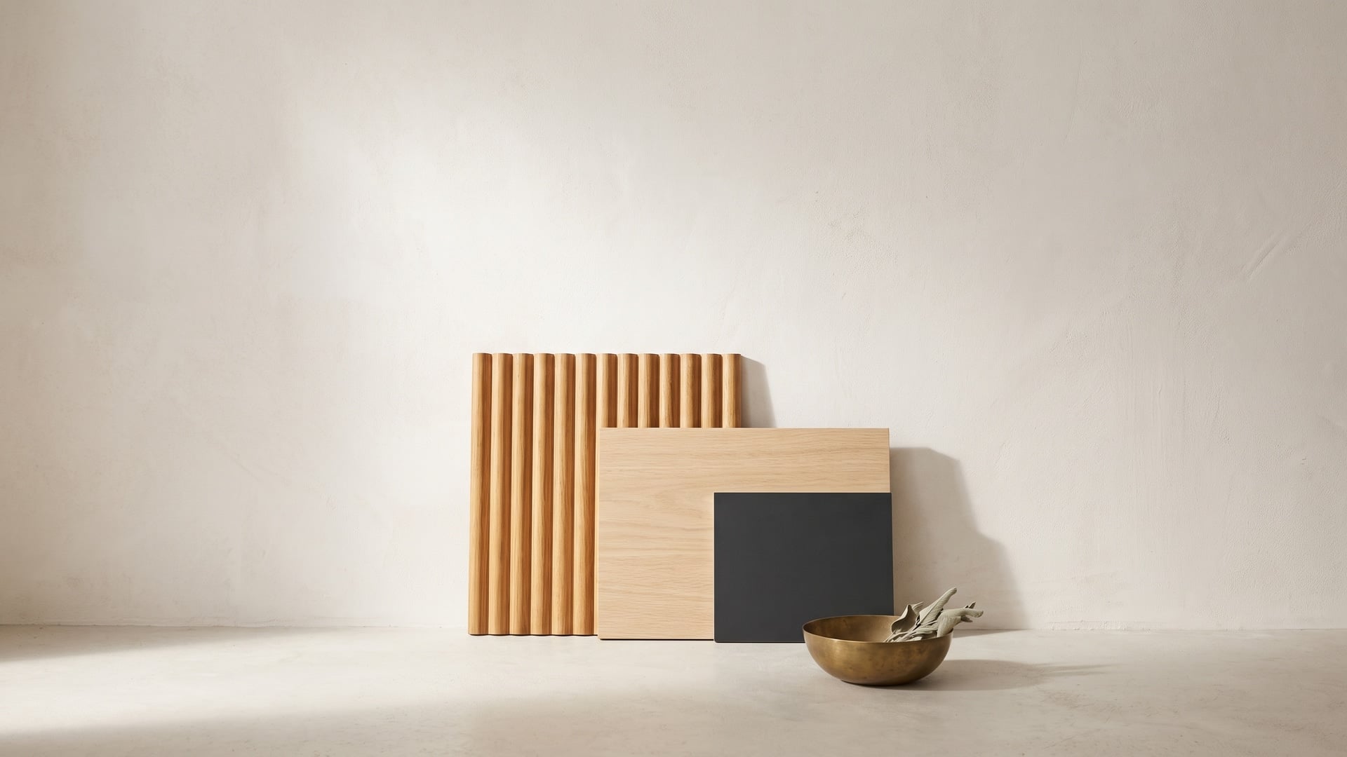
The clearest signal of 2026 is that flat is finished. The feature surfaces getting specified are not loud colours but pronounced textures — fluted, reeded, grooved and lightly brushed veneers that turn a wall into a slow play of light and shadow across the day. Where a decade ago a client asked for an accent colour, today they ask for an accent surface.
The reason is partly photographic and partly human. A fluted panel reads with depth in a photograph and changes as you move past it in person, so it does the work of a feature without committing to a colour that will date. It also invites touch, which flat laminate never quite manages. We see three-dimensional veneers turning up on television walls, headboards, reception desks and — increasingly — on handle-free wardrobe shutters, where the grooves double as the grip.
How to specify it well: choose a base veneer with a calm, straight grain so the fluting reads as rhythm rather than noise; run the grooves vertically to lift a room's proportions; and light the wall from one side, grazing across the ridges, to exaggerate the relief. One textured wall per room is plenty — the effect depends on restraint everywhere else.
2. The warm-minimal palette settles in
Minimalism has quietly evolved. Its cold, white first iteration has given way to a warmer, more livable version built on pale woods and low-chroma solids: soft oak and ash, fumed walnut used sparingly, and putty, oat and stone tones that behave like neutrals but feel like something. The palette is deliberately restrained, and that restraint is exactly why it lasts — there is no statement hue to regret in three years.
This is good news for anyone building an interior to live with rather than to post once and replace. Woodgrain veneers and high-realism woodgrain laminates in these tones photograph beautifully and, more importantly, disappear into daily life without demanding attention. They also mix — a warm oak on the joinery, a putty solid on the island, a single darker note for grounding.
How to specify it well: keep the palette tight, let one natural material lead, and create interest through texture rather than by adding colours. When you compare samples, do it in the room's own light and at full size — small chips flatter, large panels tell the truth.
3. Matte and anti-fingerprint finishes become the default
Gloss is not dead, but it is now the exception. The default finish for 2026 is matte and super-matte — surfaces that scatter light instead of bouncing it, producing a soft, almost velvet quality that reads as calm and expensive. Just as importantly, matte hides the small realities of use: fingerprints, faint scuffs and the film that daily handling leaves on gloss.
The technology that made this practical is the anti-fingerprint super-matte laminate. Deep, moody, handle-free cabinetry has been the aspiration for years and the frustration for just as long, because every touch showed. Anti-fingerprint micro-surfaces fixed that, and many now let minor scratches self-heal with a little warmth. The result is that the darkest, most dramatic palettes are finally viable in a kitchen that gets used.
How to specify it well: reserve anti-fingerprint finishes for the surfaces hands actually meet — shutters, wardrobe fronts, vanity units — and for dark colours, where smudges show most. Pair a matte surface with one contrasting texture so the scheme has depth without any shine at all.
4. Real wood and the biophilic instinct
Underneath the aesthetics is a well-documented human response: people feel calmer surrounded by natural materials and patterns. Biophilic design has taken that research out of the wellness literature and into everyday briefs, and few materials deliver it as directly as visible wood grain. The irregular, organic lines of real veneer bring a quality that a flat printed imitation cannot.
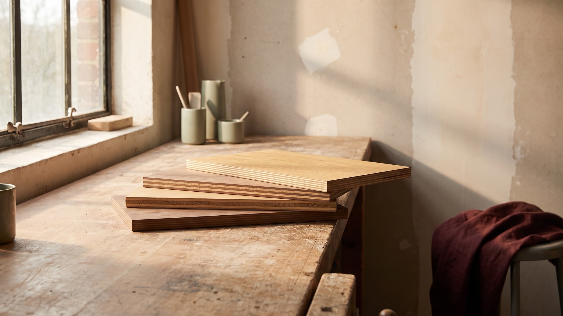
In practice this shows up as two decisions. On the surfaces you touch and see most — a feature wall, a headboard, a dining table — designers are choosing genuine wood veneer, natural or reconstituted, for its character. On the workhorse surfaces where durability rules — kitchens, high-traffic joinery — they are choosing high-realism woodgrain laminates that carry the same visual language while shrugging off daily wear. Carrying one grain across a space ties the whole scheme together and makes even a compact flat feel grounded.
How to specify it well: the effect lives or dies on authenticity, so choose veneers and premium woodgrain laminates over flat prints, and book-match veneer panels on large runs so the grain flows rather than jumps.
5. Performance becomes a design feature
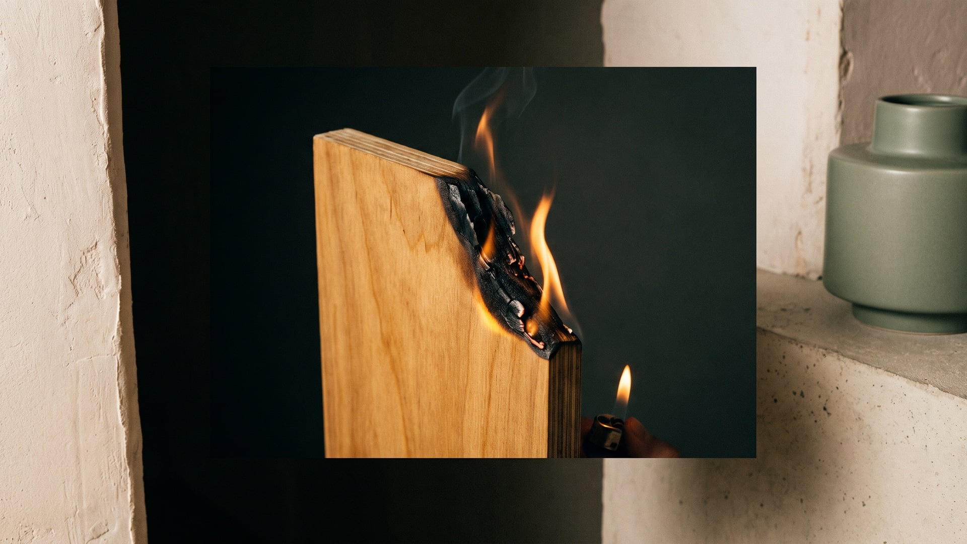
Perhaps the most important shift of 2026 is that clients now ask what a surface does, not only how it looks. Boiling-waterproof cores, fire-retardant panels, anti-viral surfaces and borer-and-termite protection have moved off the technical spec sheet and into the everyday conversation. Performance is being specified out loud, as a feature, the way people once specified a colour.
This is a healthy change, because it aligns what looks good with what lasts. A kitchen island in a beautiful matte laminate over an ordinary moisture-resistant core is a short-lived object; the same island over a certified boiling-waterproof (BWP, IS:710) core is a lifetime one. Fire-retardant grades belong wherever people gather or escape routes are narrow. Anti-viral surfaces earn their place on the high-touch faces of kitchens, clinics, schools and shared offices. None of this is visible, and all of it decides how the surface ages.
How to specify it well: match the grade to the exposure — moisture-resistant for genuinely dry zones, boiling-waterproof for kitchens, bathrooms, exteriors and anything structural — and treat certification (a genuine ISI mark against the correct IS number) as part of the specification, not an afterthought.
6. Sustainability moves from nice-to-have to expected
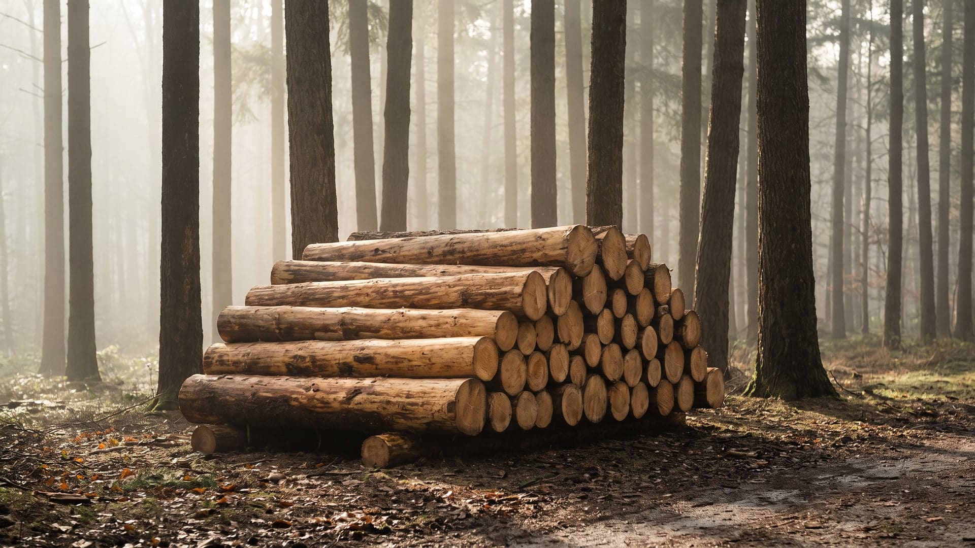
Sustainability is no longer a differentiator that a premium project chooses; in 2026 it is an expectation that a serious client assumes. The questions have also become more sophisticated. Instead of “is it eco-friendly?” the questions are specific: is the timber chain-of-custody certified, what is the panel's formaldehyde emission class, and — quietly the most important — how long will it last before it has to be made again?
That last question reframes the whole subject. The greenest surface is often simply the one you never replace, because durability removes entire cycles of raw material, manufacturing energy, transport and disposal. Low-emission adhesives (E1, and better still E0) matter more than ever as homes become better sealed and more air-conditioned, with less fresh-air exchange to carry off-gassing away.
How to specify it well: ask for genuine chain-of-custody certification rather than a logo, ask for the emission class in writing, and favour repairable materials — real wood can be refinished, where a failed laminate usually cannot.
7. Curves, continuity and the handle-free line
The design language wrapping all of this together is soft and continuous. Hard corners are giving way to gentle radii on islands, headboards and reception fronts; joinery is going handle-free with push-to-open and integrated grips; and surfaces are running continuously — one woodgrain carried from the kitchen across to the dining zone — to make open-plan spaces feel generous rather than busy.
For a surface manufacturer this raises the bar on two things: the flexibility of the material around a curve, and the consistency of grain and colour across large, uninterrupted runs. It is one more reason the underlying board and the match between panels matter as much as the face you see.
How to specify it well: plan large continuous runs at the design stage so panels can be sequenced from the same batch, and keep the joinery language consistent — if one run is handle-free, they all should be.
How to use these trends without dating your space
The paradox of any trend list is that chasing all of it at once produces a room that looks exactly like this year and nothing like the next. The way to use these directions is to treat the durable ones as the foundation and the expressive ones as the accent.
- Build on the timeless: a warm, low-chroma palette, matte finishes and the correct performance grade will still look considered a decade from now.
- Spend the drama in one place: a single fluted veneer wall or a curved island does more than texture spread across every surface.
- Let one material lead and layer texture, not colour, around it.
- Never trade grade for looks in a wet zone — the most fashionable finish over the wrong core is the first thing you will replace.
The throughline
Strip away the individual themes and one idea runs through all of them: surfaces chosen to last a decade, not a season. Texture over colour, warmth over novelty, matte over shine, real grain over imitation, performance and provenance treated as features you can name — every one of these is a vote for materials that age well and stay relevant. That is a trend we are glad to see, because it is really just good building, back in fashion. Choose the surface for the life it has to live, and it will still feel right long after the moodboards have moved on.