There is a common instinct, when planning a room, to pick one surface and commit to it — an all-veneer study, an all-laminate kitchen — as though mixing the two were a compromise. It is not. Real-wood veneer and decorative laminate are not rivals competing for the same job; they are specialists, each strong exactly where the other is weak. Veneer brings the warmth, depth and quiet irregularity of genuine timber, the character that makes a surface worth touching. Laminate brings hardness, water resistance and value, shrugging off the daily punishment that would mark a natural surface in a season. Used together and deliberately, they put beauty where it is seen and toughness where it is tested.
The catch is that mixing them badly is easy, and it reads at once as a clash — two grains fighting for attention, a warm walnut against a cool grey oak, a matte panel beside a shiny one. Pairing them well is not a matter of luck; it follows a short, learnable discipline. Almost every successful combination obeys two rules — hierarchy and undertone — and then gets the detailing right where the two meet. This guide walks through both, shows where each material belongs, and ends with a cheat-sheet you can carry to the counter.
Why mix veneer and laminate at all
Understanding what each material is for makes every later decision obvious. Veneer is a thin slice of real wood bonded to a stable core. Because it is genuine timber, no two sheets are identical: the grain wanders, the colour shifts across the panel, and it catches light with a depth no print imitates. That authenticity is its value and its limit — veneer must be sealed and finished with care, it will patina and can scratch, and in the heat and humidity of an Indian summer a poorly protected veneer is far less forgiving than a factory-hardened surface.
Laminate is an engineered surface — layers of kraft paper and a printed decor fused under heat and pressure beneath a tough, cured overlay. It is built to perform: hard-wearing, resistant to scuffs and stains, easy to wipe, comfortable around water and steam. Modern woodgrain laminates carry the language of timber convincingly, but they are consistent by design — every sheet matches the last — which is what you want on a run of identical shutters, and what robs them of the one-off character veneer has for free. Mixing the two is the sensible refusal to choose between character and durability when you can have both.
Rule one: decide the hero, then hold the proportion
The commonest cause of a jarring room is not colour but two surfaces both trying to be the star. When a feature veneer wall and a boldly patterned laminate island both shout, the eye has nowhere to rest. The fix is a decision made before buying anything: choose which surface is the hero and let the other support it.
Usually the hero is the veneer, because character is what you want noticed. The laminate then plays the supporting role — quieter, more neutral, doing the hard work without competing. That does not mean it must be dull; it means it should defer. If instead a dramatic laminate is to be the star, the logic reverses and the veneer around it recedes.
Hierarchy expresses itself as proportion, and a useful rule of thumb is a rough 70/30 split — about seventy per cent of the visible surface to the dominant material, thirty to the accent. The figures are not sacred; the principle is. An even 50/50 division reads as indecision, two materials sharing the room with no one in charge. Skew the balance clearly and the room knows what it is looking at. Count the large faces — the wardrobe fronts, the wall unit, the island — and make sure one material plainly owns most of them.
Rule two: keep the undertone in one family
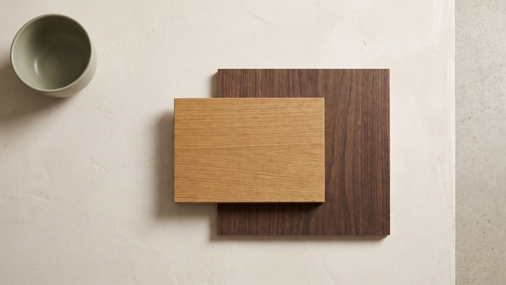
The second rule is where most near-misses are made and rescued: undertone. Every wood surface, real or printed, carries a bias beneath its obvious colour — warm, leaning honey, amber, gold or red; or cool, leaning grey, ash, taupe or smoke. Two woods can be much the same brownness and still clash badly if one is warm and the other cool, because the undertones argue even when the surface colours seem to agree. The reliable path is to keep everything in one family: warm with warm, cool with cool.
To see undertone, stop looking at the panels on their own and set them side by side. Against a warm teak veneer, a cool grey-oak laminate suddenly looks flat and slightly green; against that same grey oak, the teak looks almost orange. Placed with a laminate of the same warm bias, the two settle and agree. A quick test is to lay both samples on a sheet of plain white paper in daylight — the white strips away distraction and the underlying warmth or coolness of each becomes obvious.
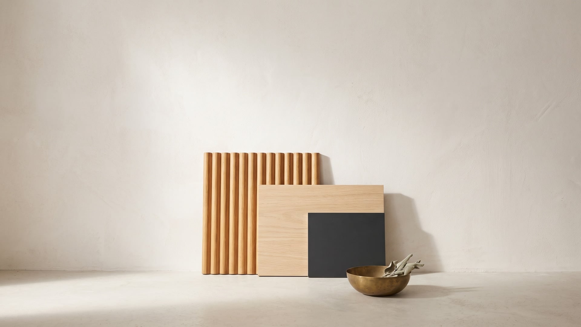
Once the undertones agree, you are free — and encouraged — to build interest through texture rather than through clashing colour. A satin veneer beside a fine woodgrain-embossed laminate, or a fluted feature panel against a plain matte field, gives a scheme depth without risking a colour fight. Contrast of surface is safe and sophisticated; contrast of undertone is the thing to avoid.
Where each material naturally belongs
Much of the decision makes itself once you match each material to how a surface is used and seen. Veneer earns its place where character is on display and wear is moderate; laminate earns its place where hands, water and heat do their worst. As a working guide:
- Reach for veneer on feature joinery — the living-room wall unit, a headboard, the visible fronts of an island or a kitchen's tall units, a statement door, a reception desk. These are seen up close and admired rather than scrubbed, exactly where the depth of real wood pays off.
- Reach for laminate on the hard-working surfaces — kitchen worktops and dado, the shutters and drawers hands open a hundred times a day, bathroom vanities, study and office desktops, and any panel in a wet or high-traffic zone.
- Always use laminate for internals — the insides of wardrobes and cabinets, shelves, drawer boxes and carcass edges. It wipes clean, takes the odd spill, and there is no case for spending on veneer where it will never be seen.
- Let exposure decide in wet and humid zones. Around sinks, in bathrooms and anywhere the monsoon reaches, laminate over a boiling-waterproof core (BWP, to IS:710) is the honest choice; save the veneer for the dry, display faces nearby.
A pattern emerges: veneer for the few surfaces that carry the room's character, laminate for the many that carry its wear. That division is not a constraint on the design — it is the design.
The detailing that makes or breaks the join
With the hero chosen and the undertones aligned, success comes down to how the two materials meet — where good schemes are quietly won or lost:
- Edge-banding. A panel convinces only if its edges match its face. Band laminate edges in a matching tone and finish veneer edges with a matching lipping — never leave a raw, mismatched core line showing at the very point the eye lands.
- Grain direction. Decide the grain's direction and hold it consistently — usually vertical on tall units and shutters, horizontal on low runs. On large veneer expanses, book-match adjacent leaves so the grain flows rather than jumps, and carry the same direction into the laminate beside it.
- Transitions. Give the two materials a clean, intentional boundary rather than an apologetic butt-joint. A shadow gap, a slim reveal, a change of plane or a natural break such as a corner lets each surface be itself; forcing them edge-to-edge invites an awkward near-match.
- Sheen. Match the finish level above all else. A matte veneer belongs with a matte laminate; set a satin surface beside a gloss one and the mismatch of reflection shouts louder than any difference of grain.
None of this is costly — it is simply the difference between a scheme that looks intended and one that looks accidental.
Test large samples in the room's own light
No sample the size of a playing card ever told the truth about a surface. A small chip flatters — it hides the scale of a grain, the real depth of a colour and, most treacherously, the undertone. Before committing, get the largest samples you can of both, hold them together, and judge them in the actual room.
Light changes everything, and Indian light especially. A pair that agrees under a showroom's cool white tubes can drift apart under a home's warm LED, and the flat grey light of a monsoon afternoon reveals undertones that harsh direct sun bleaches out. View the two side by side by day and after dark, near the window and deep in the room, under the lighting you will actually live with. Give it an hour and a few moments rather than a glance — the patience saves the expense of finding a clash only once it is built in.
Common mistakes to avoid
Almost every clash comes from a short list of avoidable errors. Watch for these:
- Two loud grains competing. A dramatic figured veneer beside a boldly patterned laminate gives the eye no rest. If one surface is expressive, let the other be calm.
- Mismatched gloss levels. A matte panel next to a glossy one reads as a mistake even when the colours are perfect. Keep the sheen consistent.
- Too many different woods. Three or four species in one room fragment it. Hold to one wood story — a single species, or two closely related — and let texture carry the variety.
- Ignoring the undertone. Matching the obvious colour while missing a warm-versus-cool bias is the classic near-miss that never quite looks right.
- Chasing a perfect match. Trying to make a laminate imitate a specific veneer exactly, and landing just short, looks worse than an honest contrast. Pair by undertone and texture, not by attempting a seamless copy.
A quick pairing cheat-sheet
When you are standing in front of the samples, run through this:
- Pick the hero — usually the veneer — and let the other material support it.
- Hold roughly 70/30 between dominant and accent; avoid a 50/50 stand-off.
- Match the undertones — warm with warm, cool with cool; check both on plain white paper.
- Vary the texture, not the colour temperature, to create interest.
- Match the sheen — matte with matte, satin with satin.
- Veneer on the faces you admire, laminate on the faces you use and every internal.
- Detail the join — band the edges, align the grain, give the two a clean transition.
- Test large samples together in the room's own light before you commit.
When it is done well, nobody sees the join
The measure of a well-paired room is that no one ever remarks on the pairing. A visitor does not stand in the doorway noting where the veneer stops and the laminate begins; they simply feel the space is warm, considered and whole. The natural surface gives it soul, the engineered one gives it stamina, and the discipline of hierarchy and undertone dissolves the seam between them.
That is the quiet craft of it. Choose the hero, keep the undertones in one family, put each material where it does its best work, and detail the meeting point with care. Do that and you have the best of both — the character of real wood where it is seen, the toughness of laminate where it is tested, and a room that ages gracefully through heat, humidity and years of ordinary use. Whichever board sits beneath, insist on the ISI mark that proves its grade, specify it once and fairly under One India · One Price, and let the surfaces do the rest. Done well, the pairing disappears; only the coherence remains.