Minimalism promised calm, and for a while it delivered something closer to a showroom. The first version of the style — the one that filled a decade of moodboards — was almost entirely white: white walls, white cabinetry, cool grey light and hard edges. It photographed beautifully and lived coldly. Strip a room of colour and clutter without putting anything warm back in, and what you are left with can feel less like serenity and more like a waiting area. The direction quietly replacing it keeps the discipline and drops the chill. Warm minimalism is still spare and uncluttered, but it is built from pale woods, soft neutral solids and light-absorbing matte surfaces that make a restrained room feel calm rather than clinical.
For a manufacturer of plywood, laminates and veneers, this shift matters because it puts the surface, not the paint, at the centre of the room. Once you remove colour and ornament, what remains is material: the grain of an oak veneer, the exact undertone of a putty laminate, the way a super-matte finish holds the afternoon light instead of throwing it back at you. Get those few things right and the look very nearly builds itself. This piece is about how minimalism grew up, why the warm-minimal palette refuses to date, and how to specify it so the result reads as considered rather than sterile.
From cold white to warm calm
Minimalism’s first iteration was a reaction against clutter, and like most reactions it over-corrected. The all-white interior looked disciplined in a photograph, but in daily use it was unforgiving — every smudge showed, warm domestic light turned it faintly yellow, and the absence of any natural texture left it feeling cool and a little anxious. In Indian homes, where kitchens work hard and daylight runs warm, the pure-white scheme often aged faster than the family living in it.
The second iteration keeps everything that was good about the first — few materials, clean lines, quiet surfaces, nothing shouting — and simply changes the temperature. Cool greys give way to warm neutrals; flat white gives way to pale timber; and the hard, reflective finishes give way to soft matte ones. The restraint is identical; the feeling is completely different. A warm-minimal room is calm without being austere, because the calm now comes from natural material rather than from an absence of it. There is a well-documented human response underneath this — people settle in the presence of wood grain and tactile, natural surfaces — and warm minimalism simply puts that instinct to work.
Why the palette refuses to date
Trends live at the saturated end of the colour wheel. The teal season, the millennial-pink season, the sage-green season — each was a high-chroma statement, and each dated the moment the next arrived. Warm minimalism lives at the opposite end, among low-chroma, near-neutral tones where there is simply no statement hue to regret. That is the whole secret to its longevity: you cannot fall out of love with a colour you never fell into.
These tones also carry a longer memory. Putty, oat, stone, ash and oak are drawn from clay, timber and rock — materials that were here long before the trend cycle and will outlast it. Muted, earth-derived colours have read as restful for centuries, so they do not belong to any single season. For anyone building an interior to live with rather than to post once and replace, that is precisely the point. And because the palette is restrained and drawn from standard national ranges, it is practical to maintain over years: under One India · One Price, the same oat laminate carries the same price whether the project is in Pune or Guwahati, so a scheme can be matched, extended or repaired long after it was first specified.
The palette itself
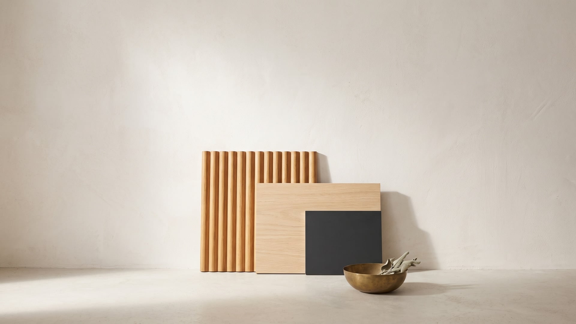
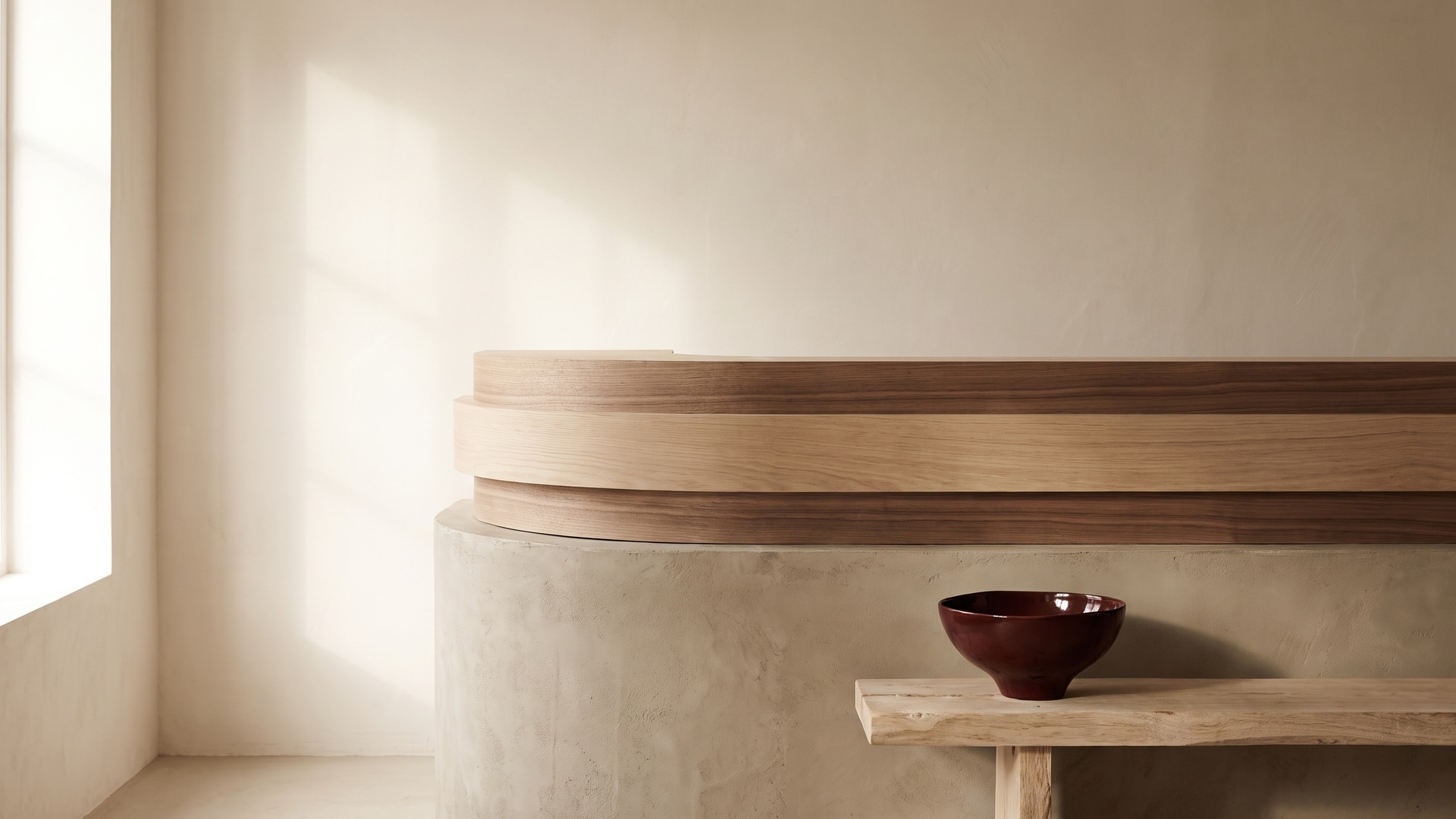
Warm minimalism is not a free-for-all of beige; it is a tightly composed family of tones, and it helps to name the parts. The backbone is pale woodgrain — soft oak and ash, with their open, straight, gentle figure — carried across joinery and larger runs to set the temperature of the whole room. Against that sit the solids: not stark white and not cold grey, but neutrals with a whisper of warmth in them. And for contrast, a darker timber used with real discipline.
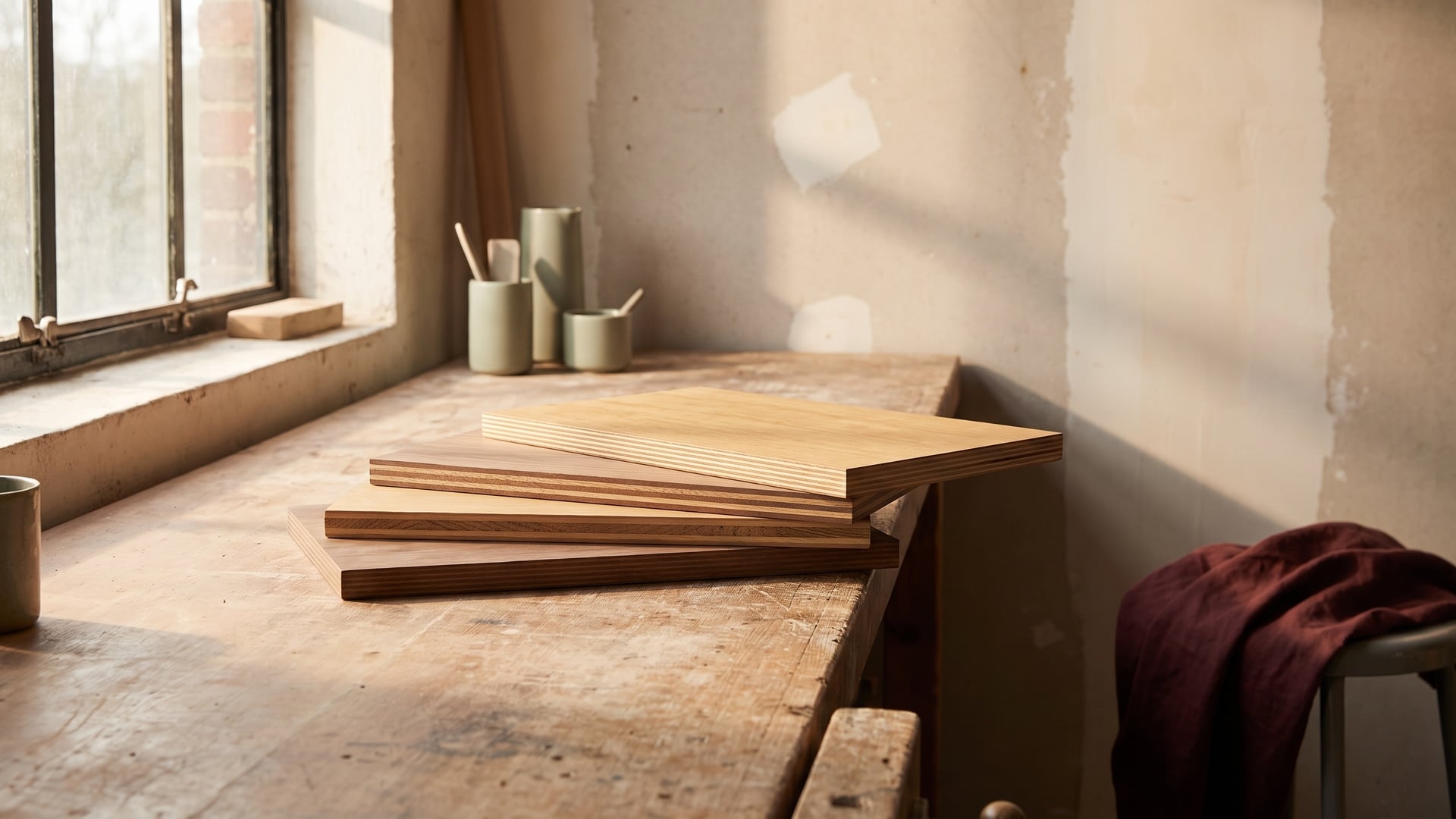
- Pale oak and ash woodgrains — the lead material, calm and straight-grained, in veneer for the surfaces you touch most and high-realism woodgrain laminate where daily wear rules.
- Fumed or smoked walnut, used sparingly — a deeper, browner note for a single shelf, a niche or one feature run, never as a field.
- Putty, oat and stone solids — warm-leaning neutrals that behave like background but feel like something, ideal for islands, shutters and wall panels.
- A grounding accent — charcoal, bronze or a dark stone, in small doses, to anchor the scheme.
The discipline that holds all of this together is undertone. Every neutral in the room should lean the same way — warm — so the greys read as greige and the whites read as oat. Drop a single cool, blue-grey neutral into a warm scheme and it will read as a mistake, even to an eye that cannot quite say why.
Why matte and super-matte do the heavy lifting
If pale wood sets the temperature, the finish decides the mood, and warm minimalism runs almost entirely on matte and super-matte. Optically, a matte surface scatters light in every direction instead of bouncing it back as a hotspot, which gives it a soft, faintly velvet depth. It reads as quiet, and — not by accident — it reads as expensive; the absence of glare is something the eye associates with considered, costly rooms.
Matte also survives real life better than gloss. A high-gloss surface is effectively a mirror, and a mirror shows everything: fingerprints, faint scuffs and the greasy film that daily handling leaves behind. A matte surface forgives all three. Modern anti-fingerprint super-matte laminates take this further — their micro-textured face resists marking, and many now let minor scratches self-heal with a little warmth. In Indian conditions, where heat and humidity mean hands leave more behind and surfaces are handled hard, that forgiveness is not a luxury but the difference between a cabinet that still looks new in year five and one that looks tired by year two.
One caution belongs here: a finish is only as good as the board beneath it. A beautiful matte face means little if it is pressed onto a core that swells in a humid kitchen, so in wet zones specify a boiling-waterproof core (BWP, IS:710) under the surface and treat the two as a single decision, not as face and afterthought.
Building the look
Warm minimalism looks effortless and is, in fact, highly disciplined. A handful of rules do most of the work, and almost all of them are subtractive — the skill is in what you leave out.
- Keep the palette tight. Two or three materials carried across the whole space, not seven competing ones. Repetition is what makes restraint read as intention.
- Let one natural material lead. Usually the pale wood. Everything else — the solids, the accent, the stone — is support, chosen to flatter the lead rather than to compete with it.
- Layer texture, not colour. Interest should come from how surfaces feel and catch light — a fluted veneer, a brushed grain, a linen-weave laminate, a honed stone — not from adding hues.
- Favour handle-free joinery. Push-to-open mechanisms, J-grooves and integrated grips keep the eye moving across an uninterrupted plane, which is the quiet, continuous line the whole style is reaching for.
- Carry the grain across zones. Running one woodgrain from the kitchen into the dining area ties an open plan together and makes even a compact flat feel grounded and generous.
Do these five things and you rarely need to add anything else. Warm minimalism rewards editing over addition.
Keeping it from feeling sterile
Every minimalism carries the same risk: strip too hard and calm tips into cold. Warm minimalism is more forgiving than its white ancestor, but it can still fail this way, and the failures usually share a cause — too much flat, uniform neutral and not enough that the hand wants to touch. Three antidotes keep a pared-back room feeling alive rather than empty.
- Let real grain show. The irregular, organic line of genuine wood veneer does something no flat printed solid can — it gives the eye a natural pattern to rest on. On the surfaces you see and touch most, that character is what separates warm from bland.
- Make surfaces tactile. Matte, brushed, fluted, woven and stone-textured faces give both hand and eye something to land on. Layering several textures at similar tones creates a depth that a single smooth neutral never will.
- Add one grounding darker note. A fumed walnut shelf, a charcoal stone top or a bronzed grip anchors a pale scheme and stops it from floating. One is usually enough; the darker note works precisely because it is rare.
The underlying principle is that warmth and texture, not colour, do the emotional work here. A room can be almost monochrome and still feel rich, provided the surfaces vary in the way they feel and the way they meet the light.
Judge samples large, and in the room’s own light
Low-chroma colours are the trickiest to specify, precisely because they carry so little colour — which leaves them at the mercy of the light around them. A putty that looks warm and soft under showroom halogen can turn grey, even faintly green, under cool north light or an unflattering LED. The near-neutrals of warm minimalism shift more than any bold colour ever would, and the only defence is to judge them properly.
This is a discipline worth insisting on before anything is ordered:
- Get the largest sample you can — a full panel, not a postage-stamp chip. Small samples flatter and mislead; large ones tell the truth about undertone.
- View it on the actual wall or worktop, in the room’s own light, at different times of day, and under the artificial lighting you will actually install.
- Judge it beside the other materials in the scheme, not in isolation — a neutral only makes sense in the company it will keep.
- Check the undertone against a sheet of true white; set next to real white, a warm neutral shows its warmth and a cool one gives itself away.
A warm-minimal do and don’t
Everything above condenses into a short working checklist.
- Do build on pale wood, low-chroma neutrals and matte finishes — the three durable foundations.
- Do keep every undertone leaning the same, warm way.
- Do let one material lead and support it with texture rather than colour.
- Do specify the right core grade under the finish — BWP in wet zones — so the surface lasts as long as it looks good.
- Don’t mix warm and cool neutrals in the same scheme; the clash is subtle but real.
- Don’t reach for a statement colour to add interest — reach for a texture instead.
- Don’t trust a small chip under showroom light; it will rarely be the colour you actually receive.
- Don’t spread the drama across every surface — one grounding note, used once, does more.
A strategy, not a trend
It is tempting to file warm minimalism alongside the other looks of the moment, but that misreads what it is. A trend is something you chase and, eventually, un-choose. Warm minimalism is closer to a decision you make once: choose restrained, natural, tactile surfaces, get the undertones and the core grades right, and then let the room age. Because nothing in the palette is pegged to a season, there is nothing to regret or replace when the season turns. Pale woods, warm neutrals and matte finishes were quietly appealing long before this cycle and will be long after it. Rooms built this way stay serene for the simple reason that they were never loud — and that, far more than any single colour or finish, is what makes the look worth specifying for the long term.